My UI suggestions

Just 2 suggestions regarding the UI:

  1. Highlighting a word changes the “See also” list to respect the highlighted word.
  2. Highlighting a word and right-clicking on it and selecting an option pops open a floating window showing search-results from your DB as small previews, scrolling allows to flip through the results.
    Any thoughts on these ideas?

Since this thread is about UI suggestions I’ll post this here.
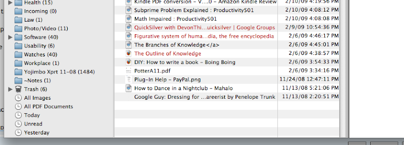
I’d like to see a labels be a bit more robust. Just having the document icon labelled doesn’t make the document pop out in a list as being important.

In this image the bottom is the current label and the others are suggestions.

Yep, the labels aren’t really an eye-catcher. I’d second an overhaul of “labels”.

I tend to agree on labels, though it was suggested to me in a previous topic that it might not be a change DEVONtech are likely to make.

UI issues are often a matter of perception and taste. :slight_smile:

In the past, a number of users have objected to the extension of the label color across the document name as too distracting, making the names harder to read, and so on. Other issues: a blue Label on a duplicate file, or a red Label on a replicant make the names very hard to read.

A few more for consistency.

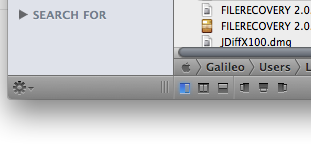
  1. Make the divider between the 3rd pane and the list of folders wider than a pixel or two and/or add a grabby handle at the bottom. The pane is easier to resize (a la PathFinder) and it looks much more finished.

  1. Also, when no vertical scroll bars are present, the dividers bordering the second and third pane are inconsistent.

Compare the view when scroll bars are present. Both pane divisions look the same:

When the browser window is longer and no vertical scroll bar is necessary, one divider has the wide vertical element and one does not. It looks sloppy and accidental.:

  1. For lack of a better description, make the titlebar of the third pane the same height as the column headers in the middle pane. It will present a more finished UI in that view.

  1. Visually distinguish between the current tab and other open tabs when using tabbed views - perhaps make one much lighter, darker etc.

Thanks

I agree that UI issues can be subjective.
I would think that if the Finder just treated labels with a colored document icon like DT there would be a feeling that they were pretty ineffective. And I really don’t consider the Finder way to be distracting. Although Path Finder goes even further and offers labels to be contained to the name or the whole row. Options! :smiley:
I agree in the case of DT the replicant/duplicate tagging could be an interesting puzzle.
Another alternative could be to use the dead space to the left of the icon/name to increase the label area enough to make a statement.

A separate column with coloured dots would even be an improvement.

I agree that labels should be improved. I make heavy use of custom icons and some of them don’t reflect the label colour. Personally I would like to have the whole line background coloured.

Concerning Replicates and duplicates:
What about changing the red and the blue to black and use italic and bold to indicate Replicates and Duplicates? Unread items could use some colour instead (unread items don’t have labels, so no conflict here :wink:

I also second the call for a more distinguished look of the current tab (and the other small things milhouse mentioned)

Johannes

So interaction design is just a subjective matter? I’m just waiting to DTP 2 get more betas to know if it will correct its huge usability issues. I hope so, really, but expressions that link UI design as subjective, fancy, based on “taste”, etc. are really discouraging.

I’d like to preface my comment by stating that the Devon folks have been great in allowing and addressing criticism.

I generally agree with radii0. There are ongoing usability issues and we’ve been, basically, hearing that these things are subjective etc for some time. Yet, many other well-regarded Mac apps seem to conspicuously lack these “UI features”.

I would be surprised if our suggestions in this thread weren’t, at least, considered.

What say ye Devon?

Some User Interface issues are tied to appearance, e.g., color, shape, design elegance, etc. A very efficient UI (in functionality) may be ugly, and hence off-putting to users. Simplicity without clutter is desirable. The new left slide-out in DT Pro/Office has functionality. At the same time, it takes up screen reals estate, and is seen by some as clutter. A keyboard shortcut is provided to give the user choice — the slide-out can be made to disappear when it’s not wanted. Some users don’t want to see it. Other users make it omnipresent because it is an efficient way to switch among open databases, for example.

Other User Interface issues are tied to functionality, and hence more directly to usability.

For example, some users have requested a broader range of colors and shades for highlighting. That’s not merely an issue of appearance, but of functionality, providing more categories of highlighting cues (perhaps for Labels, as well). Some users make a lot of use of highlighting text, others do not (I’m one of the latter). Flexibility in accommodating different preferences and workflows is important to the user experience.

Another issue involving both appearance and functionality is the introduction of the widescreen view in DEVONthink 2. This was requested by many users. It’s optional. I don’t use the widescreen view on my 13-inch laptop screen. I sometimes use it on my 24-inch monitor.

Some users wish to use the keyboard for navigation among the various panes of view windows, for moving around in the hierarchical structure of groups, for invoking commands not available in menus, and so on Some of those user interfaces are present now, some will likely be added in the future, some may be very difficult to accomplish.

There have been a very large number of requests to make this or that behavior a user-choice option in DEVONthink’s Preferences. Obviously, to accommodate all those requests would make for a lot of additional code, and a very complex user interface in the Preferences screens. Cue: response by kalisphoenix. :slight_smile:

The DEVONthink applications are evolving. The developers encourage users to make feature and UI requests and suggestions. Some of these have already been implemented in the progression from pb1 to pb3, and more will come in future releases.

Bill, you are as diplomatic as ever.

If you ever want to make a huge mark on the world, I think you should be the U.S. next ambassador at large and negotiate a middle-east peace agreement.
:wink:

Bill,

Thanks for your answer. I agree that DTP b is making efforts in improving its user interface, and that it cannot just implement every user suggestion.

However, I think that the hole new fonctionalities in version 2 needed more “design decisions” regarding the user interface. It is not just about adding shortcuts to hide or show the source bar or adding a (bad placed) toolbar button to do it. It is about rethinking why and how that sidebar is there. Most of recent OS X applications don’t need to hide the source bar because it is the center of the hole experience of working with the application. iTunes, iPhoto, Together, Papers, Coda, Evernote, etc. users will never complain about hiding the source bar, because the source bar is meant to be always visible.

What I think is odd in DTP 2 UI and interface design is that there are two “sidebars”, one is the proper source bar (blue background), and the other is the sidebar of the three panel view. Three panes “view” in “widescreen” mode , plus one source bar, plus the “see also” panel plus the pagination panel of the PDF, makes one interface consisting of 6 vertical panes!. I really think that the complexity of this application required more creativity and design decisions, other than adding shortcuts to hide or show panels.

I agree that “simplicity without clutter is desirable”, and that’s why I think some behaviors of DTP 2 UI are not as correct as one could desire.

A few years ago, Tog, one of the founders of Apples Human Interface Group, said of OS X’s tinted labels:

Coloring vector based 512px icons (or thumbnails, icon view in new apps is no more an icon view, is a thumbnail view) is impossible. I agree that gradient bubbling labels decrease readability. But the label should be applied to the text not the icon.

There was/is a lot to gripe about with Apple’s implementation of their own standards. Over the evolution of OSX users have experienced and gotten used to a lot of fugly implementations of what is perceived as logical and legible.

In the case of labels I personally think their function as a “labeling device” should be more as a visible tag than just a wispy hint of acknowledgement.

Interesting that Tog didn’t also pursue his critique to explain how a 10 or 11pt colored icon in the Finder column view would even look remotely significant as a tagging device instead of just a small colored blemish.

I posted this as another lead entry in this Suggestions area of the Forum, but its approriate here too. I would urge DTP developers to look at Gridiron Software’s innovative Flow application as a possible direction to go into for visualizing connections for data. This approach might work very well for See Also and Classification features of DTP, rather than just the list view we get now. Just a suggestion.

gridironsoftware.com/products/flow.html

Amen to all this. While the DTP 2.0 interface is a major improvement, it lags behind OS X Leopard interface standards (as implemented in Pro apps such as Aperture or in iWork 08/09). And with Snow Leopard rumoured to be taking new interface directions, DTP cannot lag behind. The DTP interface is certainly coherent, but it lacks the elegance which so regularly produces productivity boosts on the Mac.

Whil I agree with you in general, the UI of Aperture (and other Pro apps) is surely significantly different to the majority of Mac apps. I would be happy to see DTP pulled in line with the ‘standard’, non-pro look.

I think this statement captures very well my overall feelings. DTP is incredibly powerful and useful, but it lacks elegance, and this does impact on its usability. I admire Bill DeVille enormously, but I’ve noticed an awful lot of his posts recently seem to be his describing a roundabout way he achieves something in DTP that ought to be straightforward.